The Schedule Report gives office managers an at-a-glance view of what happened during any given job day — all in one place. It also helps your back office stay in sync with your crews on the ground, making daily management smoother and cleaner.
- To open the report and learn everything you need to know about a specific event, navigate to the Schedule → Schedule Reports submodule and click the eye button to open a preferred report.

- Alternatively, you can summon a report from the Workorder Jobs section of the Workorder Profile by clicking on the job's date
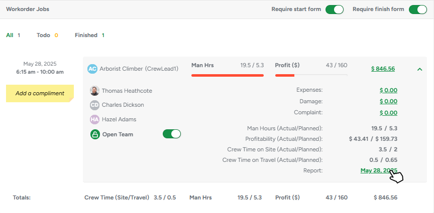
The Report
The report provides comprehensive job information, including client and estimator names, the job address, and timestamps for travel, start, and completion times.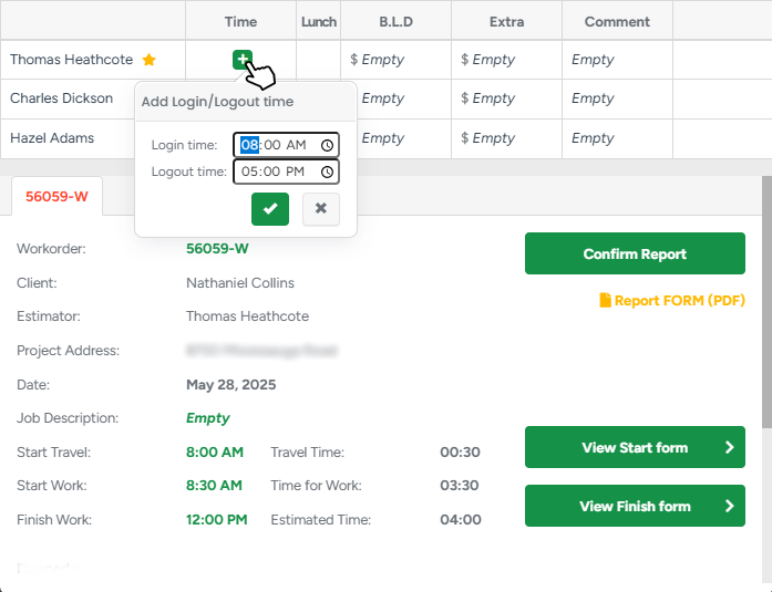
Crew grid
Every crew member scheduled for the job appears here. If someone forgot to clock in or out, just click their time and adjust it—no digging through separate time-tracking screens. You can also tick off whether the person took lunch, record B / L / D allowances, add any extra expenses, and jot a quick internal comment.
Job header
Client, estimator, address, the job’s planned vs. actual start-/finish-times, and automatic calculations for travel time and time-on-site are all pulled together here for easy reference.
Action buttons
- Start / Finish Forms open the digital forms your crew filled out on their phones (or let you create them if they forgot).
- Confirm Report finalizes the day once everything looks right.
Planned work, add-ons, and costs
Beneath the header, you’ll find the Planned Work section. Each service scheduled for that day appears with its status and price, followed by every add-on (chemicals, fertilisers, or other consumables) that was planned or used. 
The report displays:
Name & type of each add-on
Actual quantity used vs Planned quantity
Cost per unit and the total cost for what was used
If an add-on is marked trackable, its Actual Used field becomes editable, so back-office staff can correct quantities after the crew turns in their notes.
Time On Site
Crew section
The report allows for entering each person’s time on site. The crew leader is marked by an asterisk (*) so you can spot them quickly.Equipment section
The same logic applies to the equipment: the report shows hours in use on-site for that particular item.
The Report FORM
If you need a copy of the report for the client or your accountant, hit the Report FORM (PDF). The PDF mirrors exactly what you see on-screen:
Timing table (planned vs. actual)
Full job details and notes
Crew, equipment, expenses, and add-ons—only the sections that exist for that day
All running totals
In case your company prefers a more detailed file with the actual daily cost of the crew and equipment, our support team can toggle the extended PDF formats for you.
In addition to all the previous information, the extended report also displays
Worked hours for each crew member (travel + work),
Their hourly rates (pulled from User Management),
And the resulting subtotal per person. Anyone with a $0 rate is excluded from the calculation and the final report.
It does the same for equipment, pulling hourly rates from the linked equipment type and showing usage hours, subtotals, and totals — again skipping anything with a $0 rate.
Any job-related expenses (recorded separately in Job Expenses) are also shown, with the type, description, and cost, plus a total. If there’s no crew, equipment, or expenses for that day, the report automatically hides those sections to keep things clean.
Schedule Report List
The Schedule Report List is a dedicated submodule where you can view and manage all job reports in one place, making it easy to track, review, and confirm what happened in the field without jumping between calendar dates.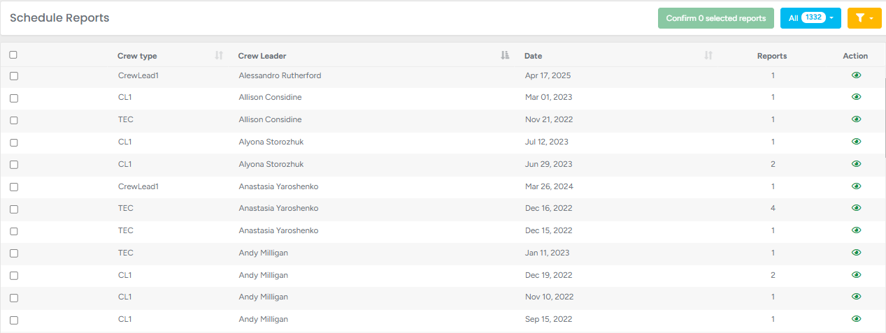
Each report is displayed as a row with key information like:
Crew Type
Crew Leader
Date of the job
The total number of reports for a crew
The Schedule Report List also offers advanced filtering capabilities, allowing you to easily locate and manage job reports based on criteria such as status, estimators, report date, etc.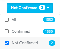
- To filter the list based on Report statuses, click on the Status (blue) filter and either choose the required status or choose the option All to see all reports that exist in the system.
The list can also be filtered by a number of criteria, such as Project Address, Client Name, Estimator, Crew Leader, and Report Date. 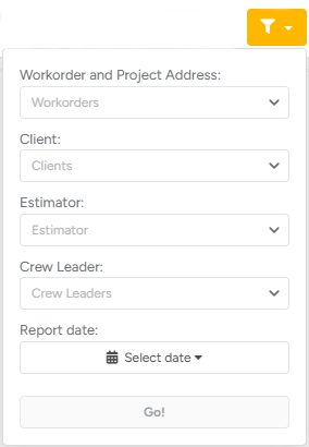
- For advanced filtering, click on the Filter (yellow) button and choose the requirements for filtering.
You can instantly confirm or download a couple or all reports at once to pull a single, merged PDF of all selected reports. Please keep in mind that if the extended report is enabled, the PDF will also display the total of the actual daily costs of the crew and equipment.

- To do so, mark the preferred reports and click the Confirm Selected Reports or Download buttons
