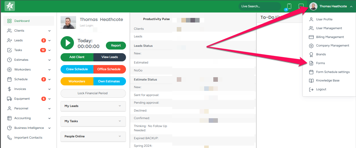
To access the Forms module, click your username in the top right corner, then select Forms from the dropdown menu.
- To create a new form, click the Add icon, then add a form title and select the required options in the pop-up window.
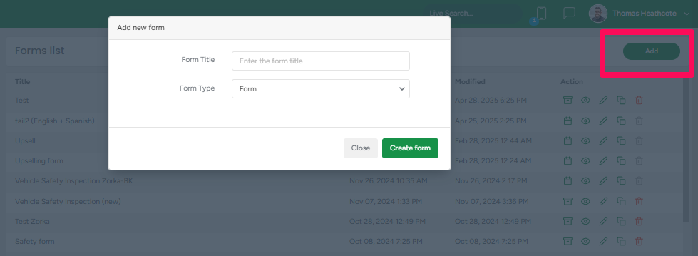
If you choose the "PDF File" option in the "Form Type" section, you can upload an already existing PDF.
On the Create a Form page, you may begin adding components from the left side by dragging and dropping them to construct the form. This process will determine the final Form object's appearance.
There are 2 types of components: General components and ArboStar components specific to the ArboStar system. Both types of components have the following sections:
Display Section of the Form Components
Here are the general components that are available in the "Display" section of the components.
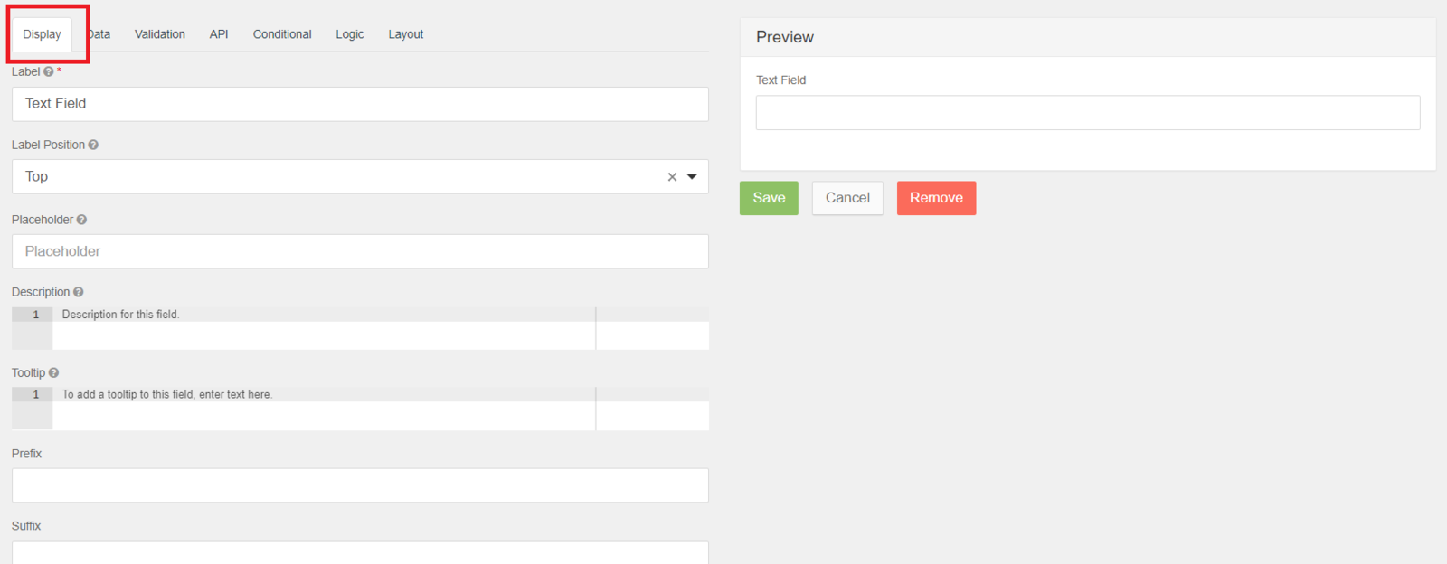
- Label - The name or title for this component that is going to display once the form is saved.
- Label Position - Position for the label for this field.
- Placeholder - The placeholder text that will appear when this field is empty.
- Description - The Description is a text that will appear below the input field.
- Tooltip - Adds a tooltip icon to the side of this field.
- Prefix - The text to show before a field. An example is ‘$’ for money.
- Suffix - The text to show after a field. An example would be ‘lbs’ for weight.
Validation Section of the Form Components
Here are the general components that are available in the Validation section of the components.

- Required - if this box is ticked, the field must be filled out, and a star sign appears next to the field's name.
- Unique - if this box is ticked, it makes sure the data submitted for this field has not been submitted before.
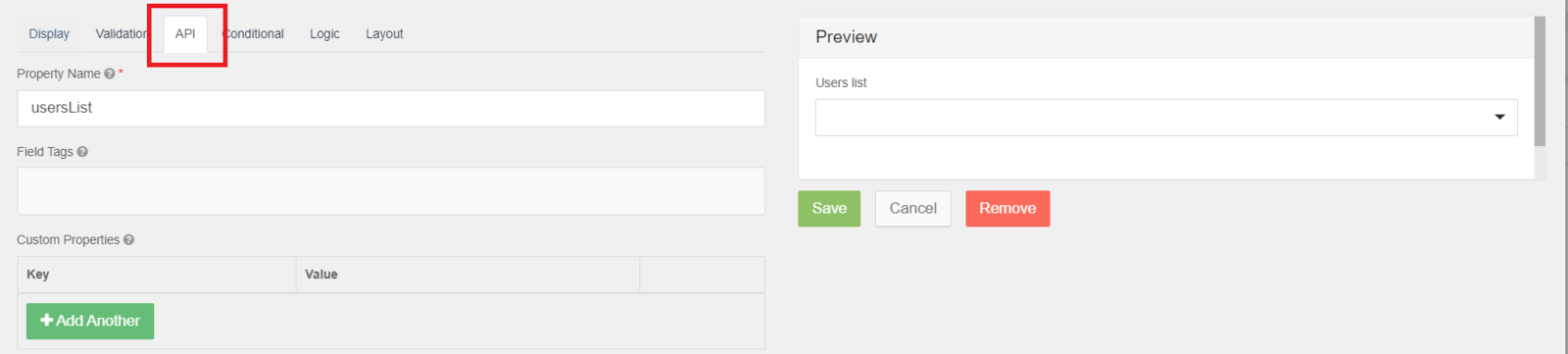
API Section of the Form Components
Here are the general components that are available in the API section of the components.
- Property Name - Property names are generated by default from the title field of the Display section.
- Field Tags - Tag the field for use in custom logic or within your application.
- Custom Properties - This allows you to configure any custom properties for this component by setting a ‘Key’ and ‘Value’ for the property.
Conditional Section of the Form Components
Form components can use conditional logic to determine when to hide or display themselves.
The conditional logic is based on the following rules:
- Each field can be hidden or displayed.
- The visibility is dependent on another component defined within the form.
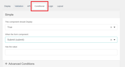
In addition to Simple Conditional logic, you can also use Advanced Conditional logic, which uses actual JavaScript for any combination of conditions.
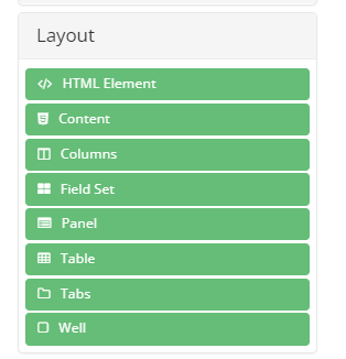
Layout Section of the Form Components
You can marginally change the arrangement of the components on your Form within the Layout settings. Each component allows for marginal layout changes from top, bottom, left, and right. To change the layout, simply input a margin amount in the Top, Right, Bottom, or Left field.
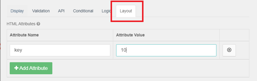
Set margins must be a valid CSS measurement input like “10px” in order to render properly.
ArboStar Components
With the ArboStar components, you can add fields that are specific to ArboStar, such as automatically adding the client or the employee's information, the ability to choose a person from a drop-down menu, or adding a signature.
Currently, there are 3 ArboStar components: Pre-filled text field Component, Pre-filled select Componen,t and Job signature Component.
Pre-filled text field Component
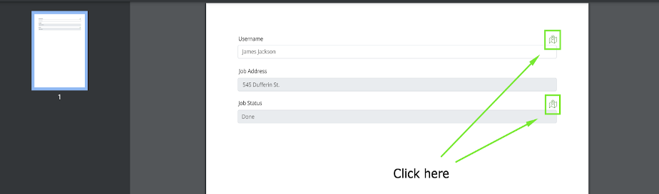
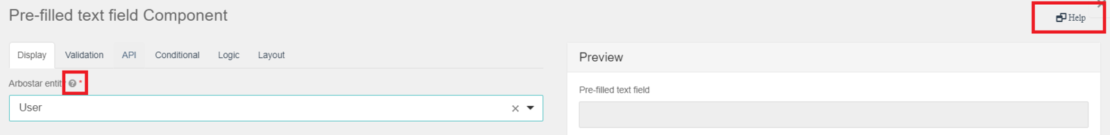
By using this component, after the form is saved, you can make the form automatically add the client, user, or job information. For that, from the ArboStar entity, choose the necessary element from the list: user, client, or job.
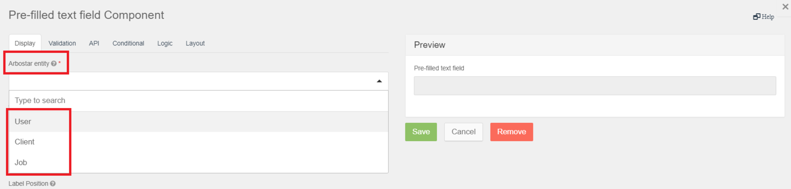
After that, from "ArboStar entity field" choose the entity of the element you require to show automatically on the form.
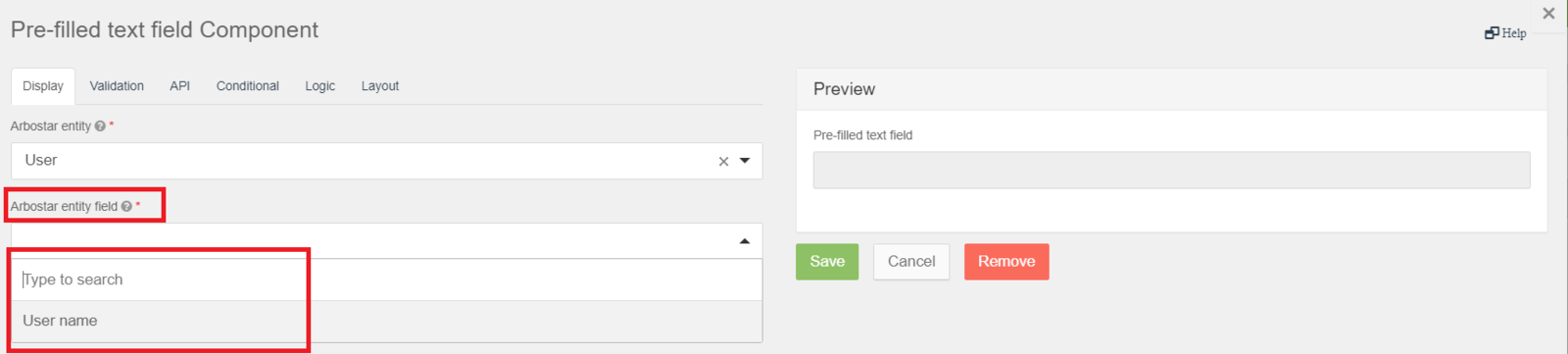
- For the user, you can add the user name.
- For the client, you can add the client's name, phone number, email, address, and contact.
- For the job, you can add the job address, the nearest hospital name, and the nearest hospital address.
Pre-filled select Component
When adding this component to the form, on the form a drop-down menu with the list of users available appears.
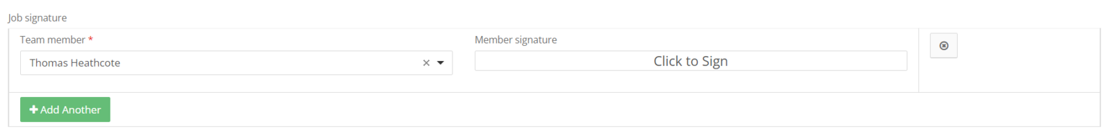
Job Signature Component
After adding this component to the form, on the form a drop-down menu with the list of users available appears. After choosing the preferred user, the "Signature" field becomes available.
Form Layout
After adding the necessary components to the form, you can also put them in the arrangement you prefer. For that, choose the layout from the "Layout" section.
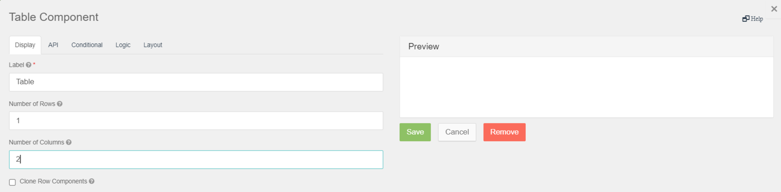
For instance, if you want to add a table to the form, drag and drop the "Table" component, and in the Display section, put the N of rows and the N of columns for the table.
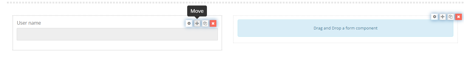
After the table is added, from the form, click on the Move button on the preferred component and drag and drop it in the favored position of the table.
Additional Information
If you want to learn more about a specific field of a component, navigate the course to the "?" sign next to the field. For more detailed information, click on the "Help" button in the top right corner of the component.
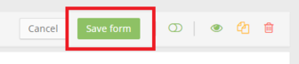
After adding the components to the form, don't forget to click on the Save Form button.
You can also:
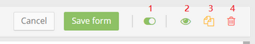
- Archive the form.
- View it.
- Duplicate it.
- Delete it.
Note: You can also change the form name, "Used with" and "Used as".

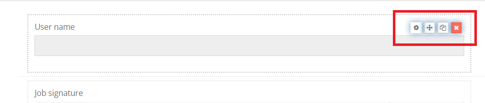
You can edit, move to a new section, copy or delete the components that you have already added to the form.
Add Geolocation
This feature is useful for tracking a field worker's location when they are filling in the form.
To enable the feature, in the Display section of the component, click on the Advanced Settings and tick the Enable geolocation box.
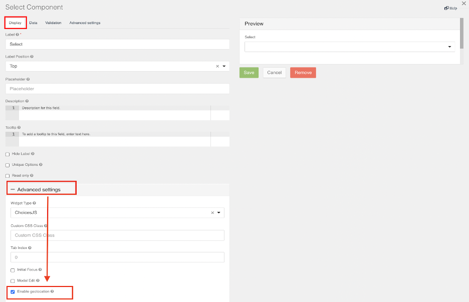
After enabling geolocation, when a user fills in the form, in the form components where the feature is enabled, you can see their geolocation by clicking on the Map icon.