View detailed support user activity stats
The User Statistics submodule provides data about support user activities in a specific time range.
Here you can see statistics for the calls, emails, and the created clients/leads/estimates/Workorders/invoices separated by users who have created them.
The section is helpful if you want to gain insights about what support users have achieved during a certain time period.
To access the User Statistics, navigate to Business Intelligence → Personnel → User Statistics.
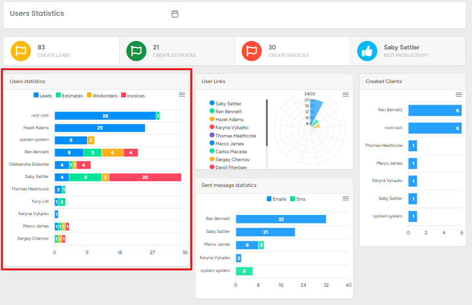
Users Statistics (Leads, Estimates, Workorders, Invoices)
You can see the data for the created leads, estimates, workorders, and invoices in the chosen time range. This feature is useful for team performance reviews, workload distribution analysis, and reporting purposes.
This chart provides a visual breakdown of user activity in the system, showing how many Leads, Estimates, Workorders, and Invoices each user has created.
Key Features:
Color-Coded Categories:
Blue = Leads
Green = Estimates
Yellow = Workorders
Red = Invoices
User Performance Tracking: Each bar represents a user, helping managers compare workload and productivity.
Export Options:
Download SVG – high-quality vector image for reports or presentations.
Download PNG – image file for quick sharing or documentation.
Download CSV – spreadsheet file for further analysis in Excel or other tools.
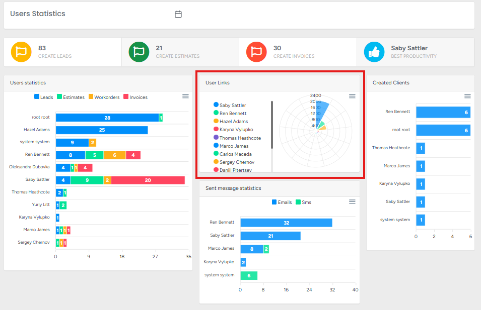
User Links
This chart provides a visual representation of user activity based on link interactions or system usage metrics. Each color corresponds to a specific user, allowing quick comparison of engagement levels.
👉 This feature helps managers compare user system interactions, identify top performers, and recognize areas where users may need more support or training.
Key Features:
Color-Coded Users:
Each user is assigned a unique color for easy identification (e.g., Saby Sattler = Blue, Hazel Adams = Green, Ren Bennett = Yellow, etc.).
Radar/Spider Chart Visualization:
Displays multiple users’ activity on a single chart.
Makes it easier to see who has the highest or lowest activity levels in certain areas.
Export Options:
Download SVG – vector format for high-quality scaling in reports.
Download PNG – image format for quick sharing and documentation.
Download CSV – raw data export for analysis in spreadsheets (Excel, Google Sheets, etc.).
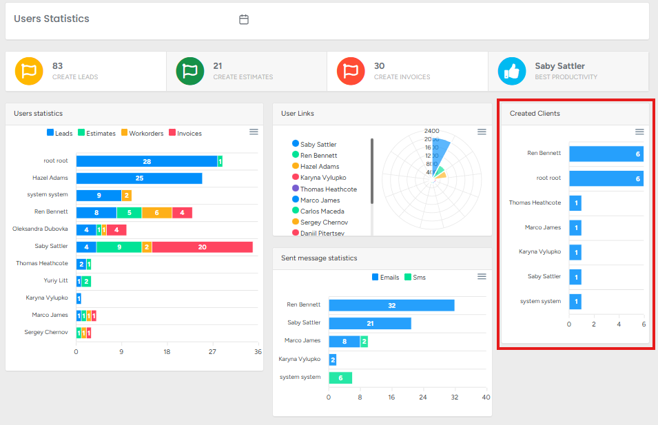
Created Clients
This chart shows the number of new clients created by each user within the selected date range. It provides a straightforward way to measure individual contributions to client acquisition.
👉 This feature is useful especially for managers to track sales team performance, evaluate client acquisition efforts, and recognize who is bringing in the most new clients.
Key Features:
User Performance Tracking:
Displays how many new clients each user has added.
Example: Hazel Adams created the most clients, followed by Ren Bennett and Marco James.
Bar Chart Visualization:
Makes it easy to compare client creation numbers across users.
Highlights top performers and identifies users with low or no new clients.
Export Options:
Download SVG – scalable vector graphic for reports or presentations.
Download PNG – image format for easy sharing.
Download CSV – raw data export for further analysis in tools like Excel or Google Sheets.
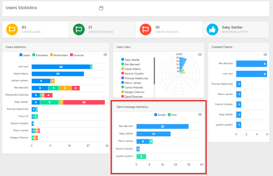
Sent Message Statistics
The Sent Message Statistics widget displays the total number of messages (both Emails and SMS) sent by each user within the selected date range. It highlights communication activity across the team, allowing you to track engagement levels with clients. Each bar is split into two colors: blue for emails and green for SMS.
Functions:
Message Tracking:
Shows how many emails and SMS each user has sent.
Helps assess user communication efforts with clients.
User Comparison:
Enables quick comparison between users’ communication volumes.
Example: Ren Bennett sent the highest number of emails and SMS combined, while others sent fewer.
Balanced Communication Insight:
Differentiates between email and SMS activity, giving visibility into preferred communication methods.
Data Export Options:
Download SVG – export as a scalable vector graphic for reports.
Download PNG – export as an image for presentations or sharing.
Download CSV – export raw data into a spreadsheet for further analysis.